A team I worked with had a Google Ads channel running at a 4x return and an events program running at 1.5x. The math looked obvious. They moved most of the events budget into Google. Pipeline went down. Not up — down. They had just defunded the channel with the cheapest next dollar to feed the one with the most expensive next dollar, and every dashboard they owned told them they’d made the smart call.
This is the most expensive mistake in GTM that nobody calls a mistake, because it photographs as discipline. You looked at the numbers. You doubled down on what was working. You cut what wasn’t. The problem is that “what’s working” was measured wrong, and the measurement error is structural — it’s baked into almost every dashboard you’ve ever seen.
The wrong number on the dashboard
Here’s the conventional explanation for why that reallocation failed: bad data, attribution noise, maybe Google saturated faster than expected. All true-ish, all beside the point. The real problem is that the team optimized the average when the only number that governs growth is the margin.
Average ROAS answers a question nobody should be asking: how efficient was every dollar I’ve already spent? That’s an accounting question. It’s backward-looking and it’s settled — you can’t un-spend those dollars. The question that actually drives the next move is forward-looking and marginal: if I had one more dollar, where would it earn the most? And the answer to that question lives nowhere on a standard channel-performance report.
The two numbers diverge most violently exactly where it matters most — near saturation. A channel’s response curve is concave: return rises with spend, but at a shrinking rate.
R = f(s), with f′(s) > 0 and f″(s) < 0
Don’t let the notation lose you — it’s saying something you already know in your gut. Read f(s) as “the return you get at a given level of spend.” The first condition, f′(s) > 0, just means more spend brings more return: the curve goes up. The second, f″(s) < 0, means each extra dollar brings back a little less than the one before it: the curve keeps bending flatter as you climb. That second condition — the rate of return itself decreasing — is diminishing returns, written down. And it forces a wedge between the two numbers you might use to judge the channel:
Average return = f(s) / s Marginal return = f′(s) = dR/ds
In plain English: average return is everything you’ve made back divided by everything you’ve put in — one blended score across all your spend to date. Marginal return is narrower and far more useful — it’s what the next dollar brings back, the steepness of the curve right where you’re standing today. The dashboard shows you the one on the left. Growth is governed by the one on the right. And for any concave curve, once you’re past the cheap early stretch, the marginal sits below the average — always:
f′(s) < f(s) / s
That single inequality is the whole problem in one line. The first dollars into Google buy your cheapest, highest-intent conversions. The hundred-thousandth dollar bids on the same auctions at higher prices for lower-intent clicks. The average across all those dollars stays high, because the cheap early conversions are still sitting in the numerator. But the slope — the return on the next dollar — has collapsed. A 4x average channel can run a 1.2x marginal return and look like a winner the entire way down, and the inequality above guarantees it’ll happen to every channel you scale far enough.
Put real numbers on it, because this only clicks with dollars on the table. Say the first $10K you pour into a channel comes back as $40K — a gorgeous 4x. You like what you see, so you add another $10K. But the cheap, high-intent buyers are already gone, so that second slice returns only $16K. Add a third $10K and it limps back $6K. Watch what each number tells you as you go:
| Total spend | Total return | Average (what the dashboard shows) | Marginal (what the last $10K returned) |
|---|---|---|---|
| $10K | $40K | 4.0x | 4.0x |
| $20K | $56K | 2.8x | 1.6x |
| $30K | $62K | 2.1x | 0.6x |
At $30K, your dashboard still reads a respectable 2.1x and every instinct says keep feeding the winner. But the last chunk of money came back at 0.6x — you spent a dollar to make sixty cents. The average is waving you forward while the margin is already underwater. That gap is the entire trap, and it’s invisible on any report that shows you one blended number.
Don’t take the table’s word for it — move the money yourself. Drag spend along the curve below and watch the two numbers part ways: the average stays flattering while the marginal — the return on the next dollar — slides under it and, eventually, under 1.0x.
Underwater: the next dollar returns 1.0x — you spend $1 to make 98¢ — yet the dashboard still shows a 2.8x average.
So the team didn’t get unlucky. They followed a number that was designed to mislead them at precisely the moment they leaned on it hardest.
What physics has been missing
The Coherence Model canon I’ve built on this blog describes states of a GTM system. Mass is your accumulated market presence. Velocity is how fast pipeline moves. Inertia is what mass becomes when it starts resisting change. These are useful for diagnosing where a system is. They say almost nothing about how it moves — how a system gets from a worse state to a better one. That’s the gap, and next-dollar return fills it.
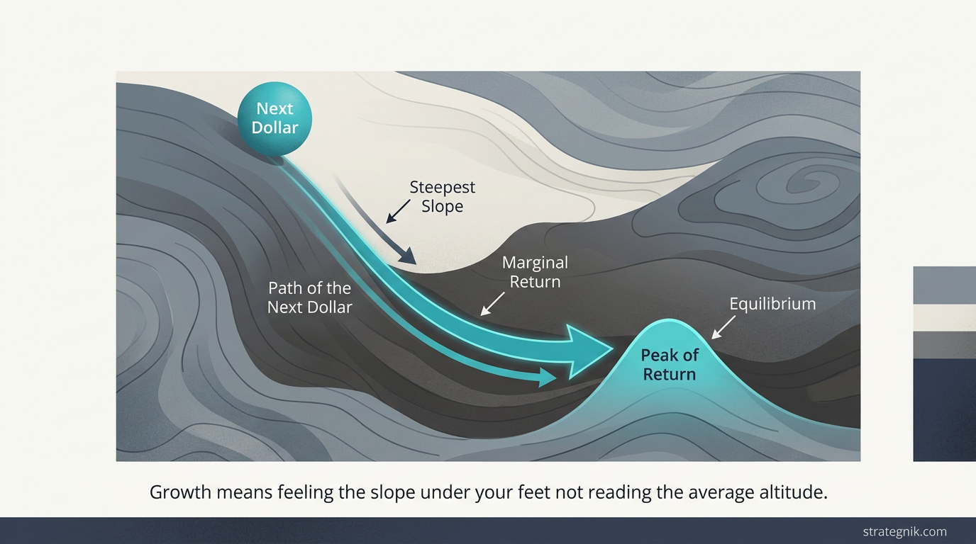
Borrow the right concept and the whole thing snaps into focus: gradient descent. A physical system seeking a lower-energy state doesn’t survey the entire landscape and teleport to the bottom. It feels the slope under its feet and takes a step downhill — the steepest direction available right now. Then it re-reads the slope from the new position and steps again. A GTM system optimizing for growth works identically, just inverted toward a peak instead of a valley: at any moment, the next dollar should go wherever the return gradient is steepest. Not the highest average. The steepest slope.
And the target state has a name physics already gave us: equilibrium. The system is optimally allocated when the next dollar buys the same return everywhere — when no reallocation improves the total. Economists call this the equimarginal principle, and it’s one line:
f₁′(s₁) = f₂′(s₂) = … = fₙ′(sₙ) = λ
Reading it left to right: f₁′(s₁) is the next-dollar return in channel one, f₂′(s₂) the next-dollar return in channel two, and so on — and the principle says you’ve arrived when they’re all equal to the same number, λ. (Lambda is just a name for that shared value: the return on the next dollar of budget, whichever channel you choose to put it in.) That’s the precise version of the sentence before it — the slopes are level. If they aren’t — if Google’s next dollar earns less than your events program’s next dollar — you’re leaving money on the table by definition, and the move is mechanical: pull dollars off the flattest curve, push them onto the steepest, repeat until the slopes equalize.
Here’s that move as the decision you’d actually make. Below are the two channels from the top of this piece — Google at a 4x average, events at 1.5x — sharing one fixed budget. Reallocate it and watch what governs the call: not the average each channel advertises, but the return on its next dollar. Try the instinctive move first — pour more into Google’s gorgeous average — and watch total pipeline fall. Then chase the steeper marginal instead.
Put the next dollar into Events. Its next dollar returns 1.4x vs 0.9x — regardless of which channel has the prettier average.
The lesson the tool makes physical: Google’s 4x average is the most seductive number on the board and the worst guide to the next dollar. The budget is best allocated not when one channel looks efficient, but when neither channel’s next dollar beats the other’s — when the slopes are level.
This is the part most “data-driven” allocation gets backward. Your highest-ROAS channel is frequently the worst destination for the next dollar, because high average ROAS is itself a symptom of a channel you’ve already ridden deep into its flat zone. The number that makes you want to feed it is the number proving you shouldn’t.
You can’t descend a hill you can’t feel
Here’s where the concept stops being a clever frame and starts being hard. Gradient descent requires knowing the slope. And the slope — marginal return at your current spend level — is exactly the thing your reporting doesn’t show you. Average ROAS is sitting right there in the platform UI. Marginal ROAS you have to go measure, because it requires answering a counterfactual: what would have happened to pipeline if I’d spent one more dollar here, or one less? Platforms can’t tell you that. They report what happened, not what would have.
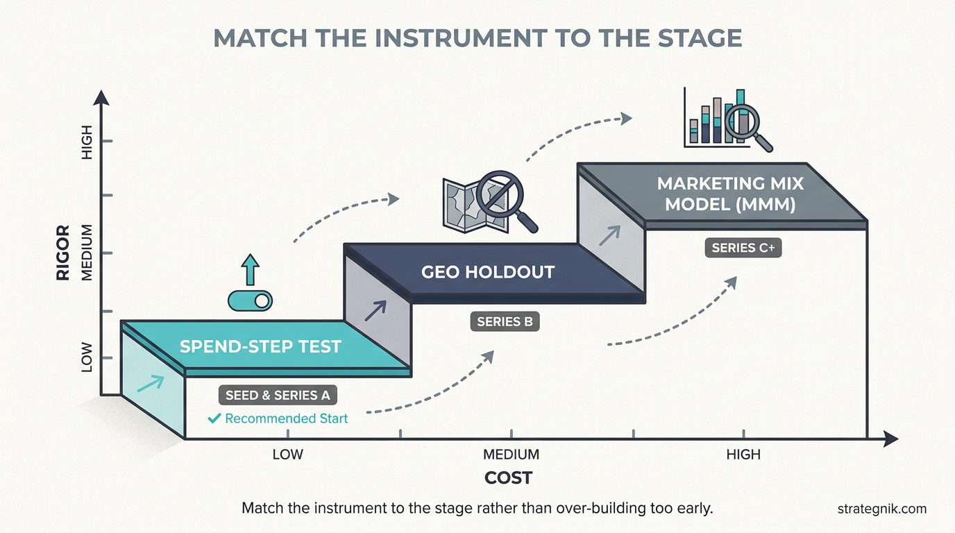
That counterfactual is the entire game, and there are exactly three ways to get at it, in ascending order of rigor and cost.
The crudest and most available is the spend-step test. Move budget in a channel by a deliberate increment — up 20%, down 20% — hold it for a full sales cycle, and watch what the incremental dollars actually produced. The slope between the two points is your local marginal return. It’s noisy, it’s slow, and at early stage it’s often all you’ve got. It’s also infinitely better than reading the average and guessing.
The cleaner method is the geo holdout. Turn a channel off in a set of matched markets, leave it running in comparable ones, and the difference in outcomes is the channel’s true incremental contribution — stripped of the organic demand that attribution quietly credits to paid. This is how you discover that a chunk of your “4x” Google return is people who’d have converted anyway. The honest marginal number is almost always lower than the platform’s, sometimes brutally so.
The most rigorous is marketing mix modeling — a statistical model fit across all channels and time that estimates each channel’s response curve and hands you the slope at any spend level directly. It’s also the easiest to get wrong, the most expensive to build, and genuinely malpractice to recommend to a Series A team with four channels and no data science function. MMM is a Series C+ instrument. Telling a young company to build one is solving a problem they don’t have yet with money they can’t spare.
Match the instrument to the stage. Seed and Series A: spend-step tests, run continuously, plus a hard discipline of watching for the inflection where a scaling channel’s marginal cost-per-acquisition starts climbing — that climb is the curve flattening, visible in real time if you’re looking for it. Series B: layer in geo holdouts on your two or three biggest line items, because by now the dollars are large enough that a wrong slope is expensive. Series C and beyond: MMM becomes worth the overhead, because you have enough channels and enough spend that the equilibrium problem is genuinely high-dimensional and no human can eyeball it.
Build the loop, not the dashboard
The deliverable here is not a better report. A report is a photograph, and the equilibrium you’re chasing keeps moving — competitors raise bids, seasons shift intent, your own creative fatigues and bends its curve downward. A snapshot of the optimal allocation is stale before you’ve finished reading it. What you’re building is a loop: measure the marginal return on each channel, move dollars toward the steepest gradient, then re-measure from the new position because the act of moving changed the curves. Step, re-read the slope, step again. The system is never done — it’s continuously descending a hill that won’t hold still.
For founders and boards: stop asking your GTM lead which channel has the best ROAS. It’s the wrong question and it rewards the wrong instinct. Ask instead where the next dollar earns the most, and whether they can show you the incrementality test behind the answer. If the answer is built on platform-reported averages, you’re funding a guess wearing a lab coat.
For GTM leaders: the unit of analysis is the slope at your current spend, not the channel’s lifetime efficiency. That means building incrementality measurement at whatever fidelity your stage affords, and reallocating until the marginal returns equalize. The team that started this story didn’t lose because Google was a bad channel. They lost because they brought an average to a margin fight — and the hill they were standing on was flatter than the one they walked away from.